blog
Six tips for e-commerce in challenging times
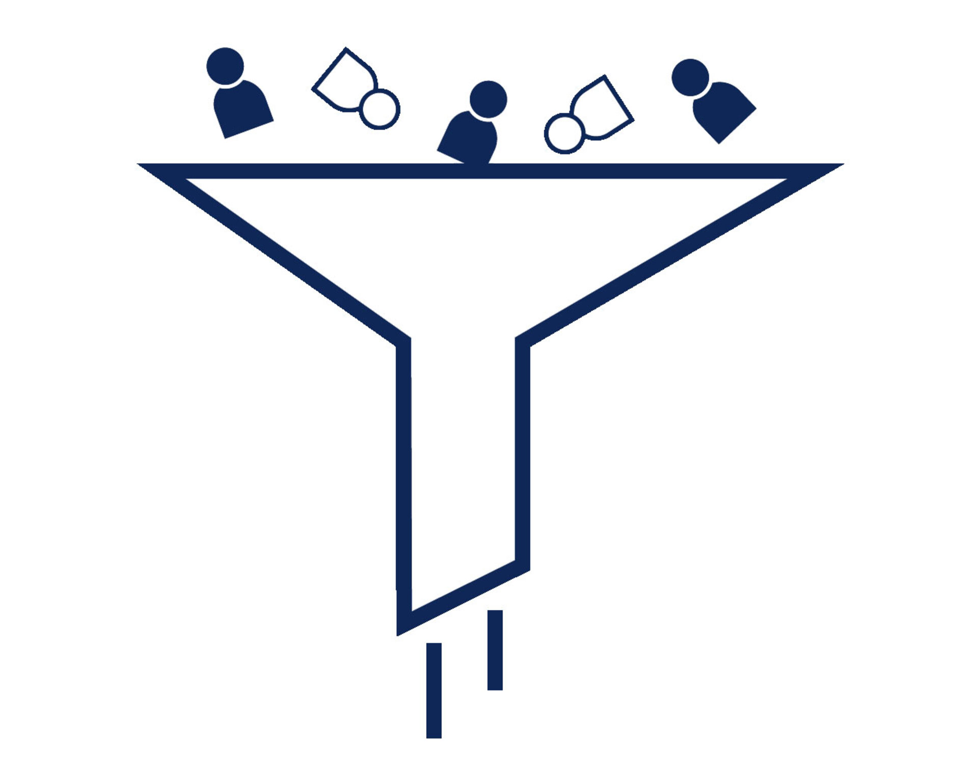
It's not easy at the moment. We want to help make things a little easier. That's why we've written six concrete tips to help you find solutions and inspiration in times of adversity. Our aim has been to prepare tips that most of you should be able to put to use right away. That's why we chose to focus on the three basic parameters you can adjust to increase your e-commerce turnover. The number of visitors, the amount in the shopping carts and the conversion rate.
Visitors x cart amount x conversion rate = turnover
We're happy to help you with all parts of the equation, but it's the conversion rate that can have the biggest impact. This is because the conversion rate is included as a percentage, and even the smallest change can make a huge difference. For example, if you have 10,000 visitors and can increase your conversion rate from 2 to 3%, you would need to find 5,000 new visitors to achieve the same impact on turnover. That's why we've particularly looked at conversion optimisation to help you make the most of your reading time.
1. Conversion optimisation
The best thing you can do for yourself and for your customers right now is to focus on conversion optimisation. It's good for your customers because it's about making their everyday life easier, your webshop more navigable and the overall customer experience better. It's good for you because it means more sales, bigger cart amounts and increased customer loyalty. You should review all customer journeys on both desktop and mobile (more on this in the next section) and check if you encounter resistance anywhere. Have you made it as easy as possible to buy from you? Are the products customers encounter relevant? Are many customers adding items to their basket without buying – if so, find out why. Perhaps something can be done.
Conversion optimisation is not one specific thing, but involves making many different small adjustments in everything from UI & UX to product information and customer service. The most important thing is that you find out where you can improve and then actually follow this through. Some of the most important improvements relate to your cart and check-out flow. Everything should be as simple as possible for the customer so that they end up buying from you. How few clicks can the customer do this with? Are shipping prices clear before the customer gets to the final stage of check-out – or will they get a nasty surprise that might make them leave? Is it easy to see what to click to move forward in the flow, or does it get lost in the noise? The check-out flow needs to be fully managed, but there are also many other factors that determine whether customers convert. For example, do you have enough product information on your site, is there a lack of images, reviews, specifications, etc.? Is the search function on your site optimal, or does it often return no or irrelevant results? Is information on expected delivery date and whether the item is in stock clear and accurate?
It's hard to say what the most important thing to optimise on your site is, but our advice is clear: You can optimise conversion, and you should do it.
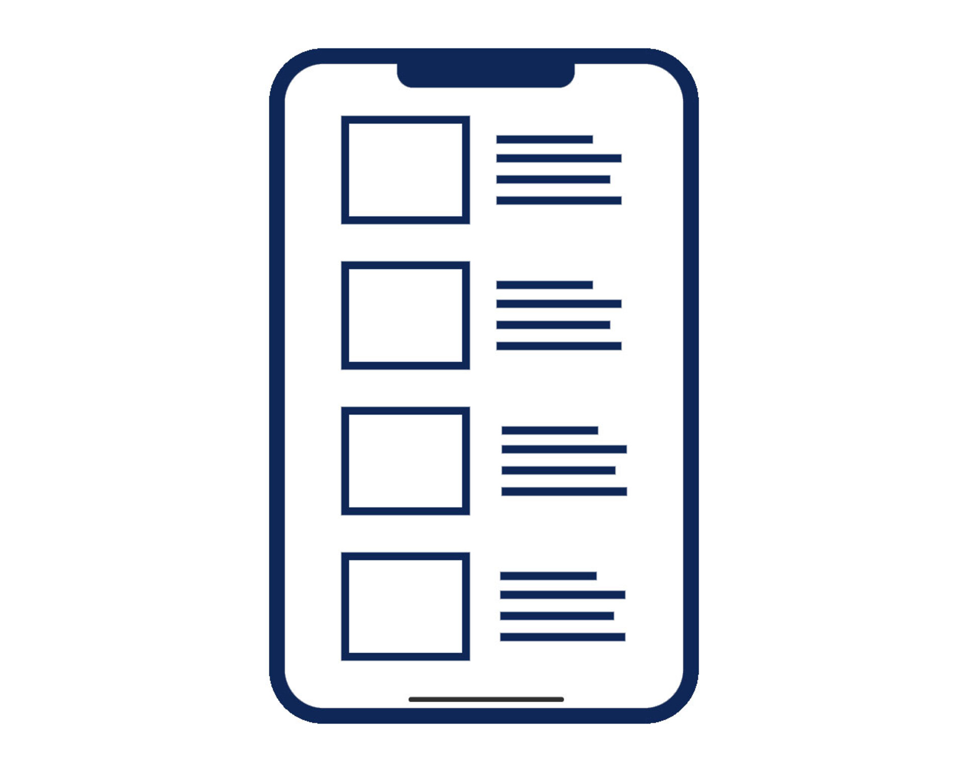
2. The customer journey on mobile
The popularity of mobile is only growing. Both for purchases on webshops and for payment. In January 2023, payment apps surpassed credit cards in popularity for online payments for the first time in Denmark. This is a reality that is unfolding right in front of us. More and more purchases are being made on mobile phones, which may sound positive, but there are downsides. Both conversion rates and cart sizes are generally smaller on mobile. This is therefore an essential area of focus for any e-commerce business.
Mobile users have less patience than desktop users. They spend less time on the site and everything happens faster. Therefore, the site must be easy to decipher and use. For example, it is essential that mobile users are able to quickly see if they can pay with ApplePay or other payment apps. If they can't, they'll jump to a webshop where they can. Payment apps are quicker than finding your credit card in your bag and entering all the details. Make it clear early on that they can pay exactly as they wish.
The second area of focus is whether your buttons are easy to reach when holding a mobile phone. Phones today are so large that it is not easy to reach all areas of a mobile phone screen with the hand holding the phone. Try holding your phone as you normally would and then try to reach the top left corner with your thumb (Opposite if you are left-handed). It's not exactly convenient, is it? Often, essential functions such as menus are located here. It simply makes it physically more difficult for customers than it needs to be. Therefore, consider how to make the user experience as simple as possible for your customers.
The final tip is to think of your desktop and mobile experience as two different sites. People visit sites for different reasons and with different purposes. Therefore, information needs to be prioritised so that the site is not overloaded and confusing. It is still important that the information is accessible, both for the customer and for SEO purposes. It is just essential that you make it available in small chunks where the customer can easily digest the content. That's why it's important to use "read more" buttons or accordions that make your site much more readable on the small screen.
3 concrete tips for better mobile customer journeys:
- Make it clear that it will be easy for the customer to pay by app
- Don't put essential functions in areas that are hard to reach on a smartphone
- Reduce complexity and information overload on mobiles with e.g. accordions.